Weibull++ Standard Folio Plot ptFSHistogram: Difference between revisions
No edit summary |
No edit summary |
||
| Line 30: | Line 30: | ||
[[File:docedit.png|20px|right|link=http://www.reliawiki.com/index.php?title=Weibull%2B%2B_Standard_Folio_Plot_ptFSHistogram&action=edit]] | [[File:docedit.png|20px|right|link=http://www.reliawiki.com/index.php?title=Weibull%2B%2B_Standard_Folio_Plot_ptFSHistogram&action=edit]] | ||
[[Category:Needs example]] | |||
Revision as of 18:06, 10 February 2012
 |
| Diagram Simulation Point Availability |
| BlockSim |
Failures/Suspensions HistogramThe Failures/Suspensions Histogram shows the frequency distribution of the failures and suspensions in the data set. The data set is separated into time intervals, and the number of failures/suspensions that fall into each time interval are plotted in a bar chart. This chart has two display options:
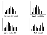
You have the option to adjust the time intervals to get a good indication of how the data points are distributed. Note that if the histogram has intervals that are, in theory, infinitesimally small, the chart will result in a plot of the probability density function (pdf). The following charts show some examples of the different frequency distributions that may appear in a histogram. A small variability in the distribution suggests that most of the units are probably operating within the design limits, while a large variability suggests that the units may be operating outside of their design limits. A multi-modal (multiple peaks) distribution suggests that multiple failure modes or mixed subpopulations may exist in the data set |
| Weibull++ Plots |

