Life Comparison Examples
New format available! This reference is now available in a new format that offers faster page load, improved display for calculations and images and more targeted search.
As of January 2024, this Reliawiki page will not continue to be updated. Please update all links and bookmarks to the latest references at Weibull examples and Weibull reference examples.
These examples also appear in the Life Data Analysis Reference book.
This page presents two alternative methods for comparing two data sets: 1) using contour plots and 2) using the Life Comparison tool in Weibull++.
Contour Plots
Using a Contour Plot to Compare Two Designs
The design of a product was modified to improve its reliability. The reliability engineers want to determine whether the improvements to the design have significantly improved the product's reliability. The following data sets represent the times-to-failure for the product. At what significance level can the engineers claim that the two designs are different?
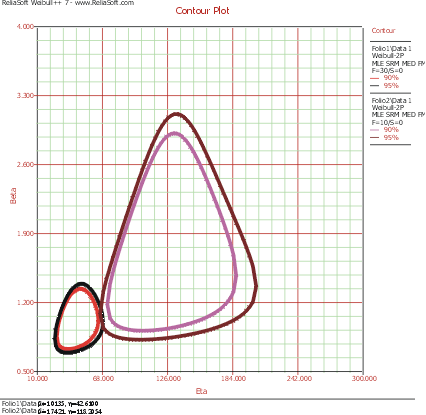
The data sets are entered into separate Weibull++ standard folio data sheets, and then analyzed with the two-parameter Weibull distribution and the maximum likelihood estimation (MLE) method. The following figure shows the contour plots of the data sets superimposed in an overlay plot. This plot is configured to show the contour lines that represent the 90% and 95% confidence levels.
As you can see, the contours overlap at the 95% confidence level (outer rings), but there is no overlap at the 90% confidence level (inner rings). We can then conclude that there is a statistically significant difference between the data sets at the 90% confidence level. If we wanted to know the exact confidence level (i.e., critical confidence level) at which the two contour plots meet, we would have to incrementally raise the confidence level from 90% until the two contour lines meet.
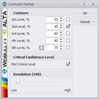
Weibull++ includes a utility for automatically obtaining the critical confidence level. For two contour plots that are superimposed in an overlay plot, the Plot Critical Level check box will be available in the Contours Setup window, as shown next.
The plot critical level is the confidence level at which the contour plots of the two data sets meet at a single point. This is the minimum confidence level at which the contour lines of the two different data sets overlap. At any confidence level below this minimum confidence level, the contour lines of the two data sets will not overlap and there will be a statistically significant difference between the two populations at that level. For the two data sets in this example, the critical confidence level 94.243%. This value will be displayed in the Legend area of the plot.
Note that due to the calculation resolution and plot precision, the contour lines at the calculated critical level may appear to overlap or have a gap.
Life Comparison Tool
Using the Life Comparison Tool to Compare Two Designs
Using the same data set from the contour plot example, use Weibull++'s Life Comparison tool to estimate the probability that the units from the new design will outlast the units from the old design.
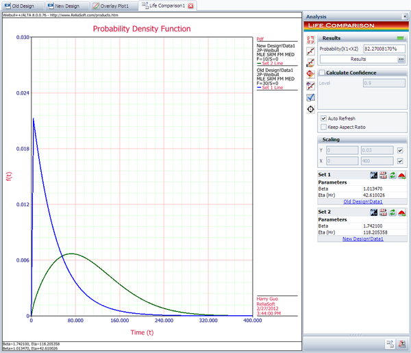
First, enter the data sets into two separate Weibull++ standard folios (or two separate data sheets within the same folio) and analyze the data sets using the two-parameter Weibull distribution and maximum likelihood estimation (MLE) method. Next, open the Life Comparison tool and select to compare the two data sets. The next figure shows the pdf curves and the result of the comparison.
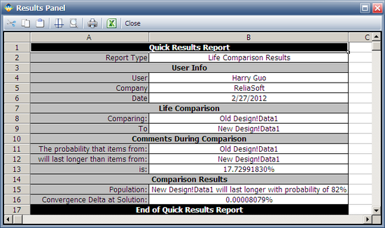
The comparison summary is given in the Results Panel window.


