Template:Webull++ Standard Folio Plot Type Example: Difference between revisions
(Created page with ''''Weibull++ Standard Folio Plot Type Example''' Weibull++ provides many useful plots. We will use this example to illustrate them. Assume we have the following failure data. {…') |
No edit summary |
||
| Line 23: | Line 23: | ||
|} | |} | ||
Analyze the above data using MLE, 2P Weibull distribution, we have the following results. | |||
[[image: Plot Type Data and Results.png|thumb|center|400px]] | |||
Click on the Plot button, Weibull++ automatically shows the first plot probability plot. | |||
# '''Probability Plot''' | |||
[[image: Plot Type Probability Plot.png|thumb|center|400px]] | |||
You also can choose to display the confidence bounds on time, reliability, or both. Click on the '''Confidence Bounds…''' link. | |||
[[image: Plot Type confidence bound Set up.png|thumb|center|400px]] | |||
Then click on '''OK''', | |||
[[image: Plot Type Reliability confidence bound.png|thumb|center|400px]] | |||
Probability plot shows the predicted (the line) and observed probability of failure (the dots, calculated from non-parametric LDA). If the straight line can fit the dots well, it means the distribution in use is suitable for this data set. | |||
Click on the '''Plot Type''' drop down list to view all the available plots. | |||
[[image: Plot Type plot type list.png|thumb|center|400px]] | |||
We will explain each plot type in below. | |||
# '''Reliability vs. Time Plot.''' | |||
[[image: Plot Type Reliability plot.png|thumb|center|400px]] | |||
It shows how reliability changes with time. Similar to the probability plot, it has both the predicted and the observed reliability values on the plot. | |||
# '''UnReliability vs. Time Plot.''' | |||
[[image: Plot Type UnReliability plot.png|thumb|center|400px]] | |||
[[image: Plot Type failure rate plot.png|thumb|center|400px]] | |||
[[image: Plot Type histogram plot.png|thumb|center|400px]] | |||
[[image: Plot Type Pie plot.png|thumb|center|400px]] | |||
[[image: Plot Type Time line plot.png|thumb|center|400px]] | |||
Revision as of 18:29, 7 March 2012
Weibull++ Standard Folio Plot Type Example
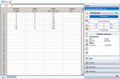
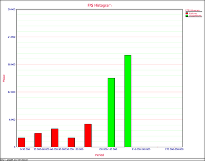
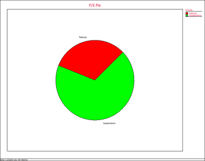
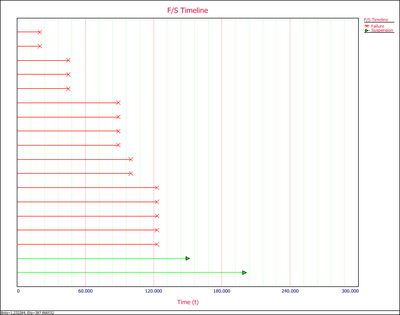
Weibull++ provides many useful plots. We will use this example to illustrate them. Assume we have the following failure data.
| Number in State | State F or S | State End Time |
| 2 | F | 20 |
| 3 | F | 45 |
| 4 | F | 89 |
| 2 | F | 100 |
| 5 | F | 123 |
| 15 | S | 150 |
| 20 | S | 200 |
Analyze the above data using MLE, 2P Weibull distribution, we have the following results.
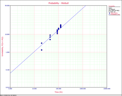
Click on the Plot button, Weibull++ automatically shows the first plot probability plot.
- Probability Plot
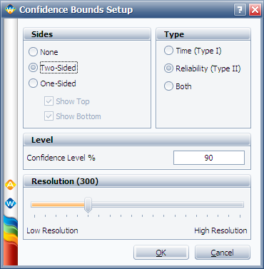
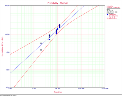
You also can choose to display the confidence bounds on time, reliability, or both. Click on the Confidence Bounds… link.
Then click on OK,
Probability plot shows the predicted (the line) and observed probability of failure (the dots, calculated from non-parametric LDA). If the straight line can fit the dots well, it means the distribution in use is suitable for this data set.
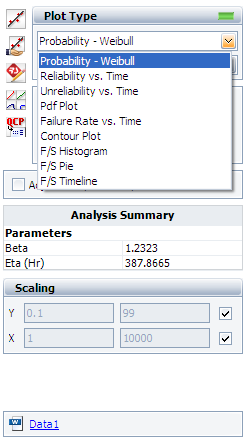
Click on the Plot Type drop down list to view all the available plots.
We will explain each plot type in below.
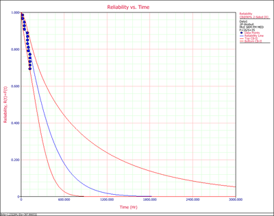
- Reliability vs. Time Plot.
It shows how reliability changes with time. Similar to the probability plot, it has both the predicted and the observed reliability values on the plot.
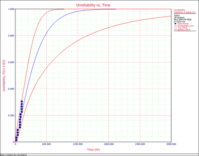
- UnReliability vs. Time Plot.
